|
|
 |
|
"Circus" Added on: Fri Jun 18 1999 |
| Page: 1 2 3 |
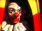
After this I created the big plastic ears, the cap with hair, the body and the collar. To make the ears I just drew an ear-shaped spline and beveled it to get the thick edge. I assigned a pink raytrace material with plastic looking properties, and added the same pink color to the translucency slot.
For the hair I used a geosphere with heavy noise modifier and FFD modifier to get things in place. A metal shaded material with high shininess values and a noise bump map.
For the cap to which the hair is attached I used a basic plastic material that had a slightly different diffuse color than the skin color. This makes him look more stupid I think.
For the body I just used a beveled spline with a meshsmooth added. You don't see much of it, but there should be something to give the impression of a body. The collar was created with a bent cone that I rotate-cloned a couple of times after which I added a noise modifier to make wrinkles and folds. I used a raytrace material with a dirty white diffuse color (noise map) and the same map went into the translucency channel to give it the impression of a light, thin material. Shininess etc are 0 to give it a cloth like appearance.
Well that's pretty much the clown himself. So then I began to add the other highly interesting stuff. The drapes behind which he's standing are extruded curly splines with an FFD applied, so I could bend it a little bit to create the opening through which he's looking. Behind him is the same kind of object. I used a checker map with a red-black noise in one slot and a yellow-black noise in the other. This made it look dirtier. Of course a small noise bump map.
Behind him are some other attributes as well, which added some symbolic value to the story of the original concept (a ropeladder, a cannon with cannonballs, some boxes). When I was fine tuning the lighting it just seemed to distracting from the clown himself, so I obscured the whole room behind him. That way the contrast both visually as well as symbolically was greater.
The lighting was done by four lights. A very dark blue one with a low multiplier value (0.27) and no shadows in the space behind the clown. I created three spotlights in front of him: A bright dark blue coming from the front-left, casting shadows, with a multiplier of 0.67, a brown-orange one from the front-middle, multiplier 0.27, no shadows. This is what I consider a fill light, which gives the picture a warm, dense feeling.
And finally a pale yellow orange coming from the right, with a high multiplier value (1.43), casting shadows. This is the main spotlight that's aimed at the clown. I used shadow maps with varying sizes and biases for the lights.
Since the eyes and nose reflect a little bit, there has to be something to be reflected.
I created a picture in Photoshop with what I thought the clown would be looking at: The circus ring with some colourful light shining above it and some audience like spots. I mapped this picture on a quadpatch that I placed in front of the clown, toggled the self illumination to 100 and this is basically the environment.
Finally I added some glow to the entire picture to give it the extra warm, oppressed, sweaty feeling.
Well I'd like to thank Pedja for putting up these great contests every month, they're really inspiring. I hope you like the picture and maybe you've learned something from this article,
I don't know. If you have questions or remarks then I'd like to hear them. Oh, and thanks for voting for me.
The final image in wireframe and fully rendered is shown below.
 
|
 |
|
|

