|
|
 |
|
Lesson 4 - Colour and Highlights Added on: Sat Jan 06 2001 |
| Page: 1 2 3 4 5 6 7 8 9 10 11 |
Highlights
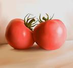
Next, add highlights to both the tomates and the leafs. Use the Airbrush for this. The highligh on the right tomato isn't very typical, its pretty diffuse and big. The highlight on the left tomato is more ordinary. Sharp and strong. However, let's stick to the photo for now, we can change the highlights later if necessary.

Highlight added to tomato skin and the leafs.
Big step here. I added a background wall and a floor using colors similar to the reflection on the tomatoes. That is, orange , yellow, orange/ brown. A shadow area was added to the floor between the tomatoes. This area is filled with water in the reference photo, so I was guessing a bit here (We'll paint in the water later.). Bounce lightning and translucensy makes colored shadows! Be sure to get that, too.

Floor and background wall.
I was annoyed by the 'pinkness' of the tomatoes throughout the steps so far. They look is if they have not properly riped. What is wrong?
To answer my own question: The digital camera used to snap the reference photo is not the best on the market and it may have lost or distorted some of the colors. Problem is, should we change the color of the tomato so it 'looks better' or should we stick to the reference?
This is the evaluation I have in almost any painting. Painting digitaly, and painting/drawing in general, leaves alot of freedom to the artist. It might be difficult to know what to do with it.
Say for instance that you paint a person's portrait. Should you or should you not include imperfections in the drawing?
Making things too perfect makes the painting artificial. But an added imperfection might draw too much attention and 'ruin' the image. As for our tomatoes, I choose not to change the color of the skin. At least for now.
|
 |
|
|


